Wednesday, December 10, 2014

This could turn out to be a very big day...

...for the cause of walkable urban places here in New England's central city

I'm sorry I missed the Mayor's speech about development issues before the Boston Chamber of Commerce this morning. Seriously. I had a conflict, but had I known what he was going to say, I would have been there. The news that he's finally made Brian Golden the actual, as opposed to just interim, director of the BRA is big enough, but then the Mayor went on to say the following:

Planners talk about “Smart Growth.” But it goes deeper. It’s about our identity. Our values. Our vision. We should show America there’s a better way to grow. A Boston way. Growth should enhance the best qualities of our city. Neighborhoods should reflect our historic tradition and our bold innovation. Our economy should be world-class and inclusive. New buildings should be creative, sustainable, and inspiring.
I want to share with you some new policy initiatives that illustrate how we are shaping our growth around these values.
We start by moving forward one of the key strategies in our Housing Plan: Growth Zones for transit-oriented workforce housing. Boston needs more housing. But there is no one-size-fits-all solution. Every neighborhood has its own character. In some places, density is not only appropriate – it is badly needed.
 It is needed to bring prices back within reach.
 It is needed to spur retail investment.
 It is needed to breathe new life into under-developed streets.
We’re starting with two transit corridors. One Growth Zone will run along the Red Line, on Dorchester Avenue between Broadway and Andrew stations in South Boston. Another will follow the Orange Line in Jamaica Plain, from Forest Hills to Jackson Square. The T stops in these great neighborhoods should be embedded in thriving, healthy, walkable communities. And they will be.
More zones will come. When other neighborhoods see the kind of vibrancy that smart density produces, the conversation about new housing across our city will change for the better.
To borrow a phrase from Charlie Pierce -- Do you see what the Mayor did there? He laid out the the broad vision -- places that are creative, sustainable, and inspiring. He talked about a specific policy initiative: Growth Zones for transit-oriented workforce housing. Then he said the key words -- "In some places, density is not only appropriate -- it is badly needed." 

And then...he named two names:

  • First, Dorchester Avenue between Broadway and Andrew stations on the Red Line, and, then, 
  • Second, the Southwest Corridor between Forest Hills and Jackson Square stations.

 [Brief aside: Your humble blogspondent has previously given voice to the do-over needed on the Southwest Corridor here: Of the Bartlett Square Condos]

Now, the details of Growth Zones obviously need to be fleshed out and fought over and they can't be temporizing or putting off battles to another day or the next project, but I think we'll get to that pretty soon. The big news here is that there are now 2 corridors in existing neighborhoods -- not out in the Seaport/Innovation District, or the Allston Interchange or some other relatively clean slate -- where the City's highest elected official and the one who wields most of the power has said we want and need to see housing growth. We've all known for a long time that luxury condominiums downtown and on the waterfront are nice to look at and without question have improved the streetscape, but you really couldn't know that the tide was turning until the City actually put a stake in the ground and said more intense growth would happen in existing places with lower land costs and therefore a better shot at producing homes and apartments for people with incomes more in line with what most of us can afford. That day has now come.

From this day forward, the goal has been set. We know what the City's direction is. So now, we speak up for Growth Zones that actually promote growth and the right kind of development in the right places. And the Mayor indicated that "More zones will come." Let me be the first to highly recommend my own corner of the world, Roslindale Square, a.k.a., God's Country. The square has tightly woven existing urban fabric and a whole slew of one-story commercial buildings that were once two and three stories and can be again. We have fantastic bus transit service, perhaps the best in the entire region for an outlying location, by virtue of which we experience effectively headway service for the 1 mile trek to or from Forest Hills and the Orange Line terminus (and that stretch is flat enough that meaningful bike infrastructure would make the subway that much more accessible). We have a commuter rail stop on a line on which Saturday service will be restored at the end of this month. And we have an active main streets organization (the first urban main street in the US) that can help the BRA, our local electeds and the rest of the City government lead the conversation for a Growth Zone that will allow us to capitalize on this opportunity at this moment.

I repeat, the day has come, and we have the Mayor to thank for it.


The full text of the Mayor's prepared remarks can be found here.

Blog Post No. 2014-13

Tuesday, November 18, 2014

Whither the Innovation District...

...or the rare occasion on which Robert Campbell goes a bit overboard.

The Place:


Credit: seaportinnovationdistrict.com.


The Article: This is another in our series of reviewing what certain key regional media outlets (usually The Boston Globe) are saying about the urban scene (a.k.a., They-report-it-and-we-give-it-the-once-over). This time around we're back to weblog inspiration Robert Campbell, who recently took on the evolving state of urban design affairs in the Innovation District and found it sorely lacking in Innovation District needs a human touch. There's a fair amount of truth in what Campbell says, but from my perspective we need to remember that, for all of the faults identified, we're trading 50+ years of surface parking use for much, much improved urban fabric and the district is only partially built out. Reserving judgment is almost always the better path. And the reference to office parks in suburban Dallas feels unnecessary and gratuitous - there is plenty of office park terrain right here in eastern Massachusetts to provide a point of comparison. Perhaps the most far-reaching and ultimately non-recoverable mistake was allowing the street network to be dictated by then-EOT on an effectively superblock/suburban arterial model that puts the really fine-grained urban fabric of places like Beacon Hill or the North End out of reach. Campbell is also right about the highlights (especially Independence Wharf and the park at D Street) and the real lowlight, which is Seaport Boulevard, the district's main drag. Giving Seaport Boulevard a better treatment than overwide travel lanes and concrete paved medians would be a huge step in the right direction and one that should be taken sooner rather than later.

Blog Post No. 2014-12.

Monday, October 27, 2014

City Hall Plaza starts its needed downsizing...

...and the MBTA finally starts on a Government Center Station headhouse that meets its location


Act 1: The former headhouse,
now demolished.
Act 2: The new headhouse,
under construction.


Act 3: The new headhouse,
as it will look upon completion.


The Location: City Hall Plaza, Boston, MA.

The Story: We've visited this location for the weblog before, advocating for rotating, temporary installations back in April 2010, thinking about more aggressive street re-introduction later that year (since the plaza obliterated a very tight piece of urban fabric half a century ago that has its own restoration logic, even though it is virtually impossible to achieve), and countering revisionism about City Hall itself in 2012. Having finally concluded, I think out of necessity, that a massive re-do isn't feasible, the new administration finally decided earlier this year, with the help of Utile Architecture + Planning, as its main planning consultant, to openly opt for a kind of tree-led downsizing of the plaza's blank and badly dysfunctional slate. You can see the overall gameplan here:


Credit: Utile; Architect's Newspaper.

And the effort, interestingly, is being led by the replacement of the hideously god-awful, bunker-like, 1960s-era Government Center station headhouse with a new glass headhouse and pavilion that is much more substantial in all dimensions, and will provide a real sense of arrival/departure when completed in early 2016. To go into and out of the old headhouse on a regular basis, or even only occasionally, was to know, deep down, just how unimportant rail transit was to a city and commonwealth that, to speak plainly, absolutely relies on rail transit to keep it from seizing up completely on auto congestion. It gave you almost a palpable sense of sadness.

It appears that this initial phase will include the "bosques," or groupings of trees, shown along Cambridge Street and adjacent to the headhouse as well as the new stairway-eliminating ramps and wider sidewalks at the intersection of Cambridge and Court Streets. Eventually, several additional bosques are planned to help create a more manageable, intimate central gathering place. I'm usually not one to suggest that just dropping in some happy trees to hide your urban design mistakes, whether new or old, is a good idea, but I do believe I have finally found a use for landscape urbanism. If you look closely, I think you can also see that there's an intent to surreptitiously restore Cornhill Street on the right-hand side. Now that's the kind of thing that warms a still-recovering transportation planner's heart...

Special credit to the piece by Alex Ulam posted to the Architect's Newspaper website with a date of March 5, 2014. Thanks, Alex.

Blog Post No. 2014-11.


Wednesday, September 3, 2014

Just because it's happening in New York...

...doesn't mean it's bad or shouldn't happen here

Your faithful blogspondent grew up, as is well-known by this time to RTUF Nation, down to the south. That is to say, in New York, the big, bad city of broken dreams and shattered romances. Among the surprises of living in Boston for the last 17 years (since coming north to obtain a law degree at what must be Pope Frank's favorite JD mill in the Commonwealth), perhaps the most suprising thing is the depth of the anti-New York reflex in this town. I get it about the Yankees (to begin with, who wouldn't loathe George Steinbrenner simply on sight?), and certainly the Jets, but it extends to virtually everything and is not even properly classified as a reflex. It is a deep-seated aversion, like discussing the theory of evolution among certain fundamentalists, or trying to get my friend Frankie-bell Galvin to agree that the sun rises in the east after he's heard President Obama just said the same thing. It's subconscious, it's visceral, it cannot be reasoned with, but, on the plus side, it tends to hurt only the benighted.

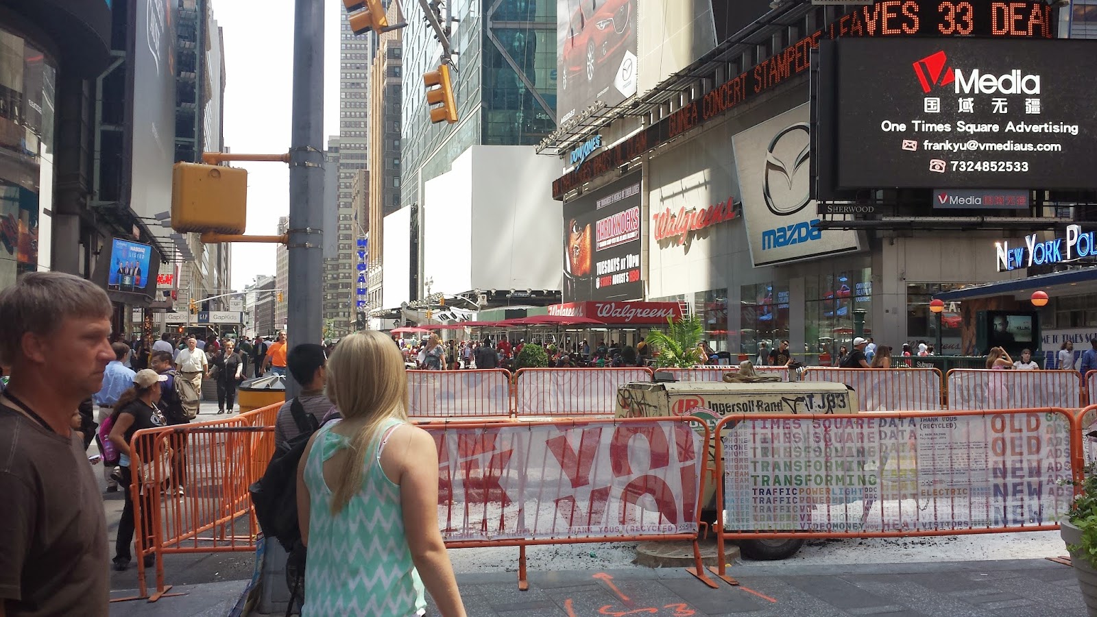
This all came forcefully to mind recently when I had the opportunity to sit down with some fellow tactical urbanism proponents and a former city official and brainstorm about where and how Boston might find the way to turn some of its excess, underused and unsightly public space into vibrant urban spaces and plazas. The conversation wound its way around to a brief discussion of one key tactical urbanism tactic -- the overnight public plaza within an existing street right of way that ultimately matures into a permanent public space. As it so happens, perhaps the highest profile and most successful of this kind of TU intervention has been Times Square in New York. Basically, virtually overnight several years ago, NYCDOT's then-commissioner, Janette Sadik-Khan, moved forward, on land her agency controlled within the existing street right of way of Broadway, and shut down auto traffic on the iconic thoroughfare from 42nd to 47th streets, allowing auto traffic only on the cross streets. To someone on foot, tourist and native alike, this was a no-brainer. To go to Times Square before this change was really to be in Times Traffic-Islands-Narrow-Sidewalks because the pedestrian-available parts of the square had been systematically squeezed back over the course of the automobile era to the point where the ratio of the space for cars to the space for people was grotesquely out of whack. Something had needed to happen to reverse this ratio for many, many years. Rather than do nothing until the final plaza could be built, Ms. Sadik-Khan, to paraphrase Boston's own Mel King, identifed the mess, found the broom in her hand to be more than sufficient to get meaningful change going, and started sweeping.

Now, five years on, the permanent installations and art work are well underway or already on the scene and Times Square feels much, much different. And it's all due to a willingness to use low-tech, low-capital cost, temporary interventions to show what can be done, demonstrate and actual experience what can be and build a constituency around permanent change for a place. What a shame that one reaction during the discussion was deeply reflexive -- what good is anything from New York? -- and also tragically emblematic. It would be a shame of epic proportions if Boston misses this wave just because the folks who dress in black 3.5 hours to the south have done it first. And, yes, I'm looking specifically at you, Franklin Street at Arch Street - NYC Phobia can't save you forever!!

View 1 - South on Broadway, across the block between
42nd and 43rd streets.

View 2 - North on Broadway, across 7th Avenue
to the Cohan statue in Duffy Square.
Blog Post No. 2014-10.

Saturday, August 2, 2014

We are living in the golden age of good beer in this country...

And your faithful blogspondent visited Tree House Brewing, yet another strong signal of this fact, a week ago out in Monson, MA. Here are the pix:

Photo 1: Tree House is now located on Koran Farm in Monson, MA.
Photo 2: The brews are dispensed from a small tasting and swag shed across from the silo.
This was the line at around 10:30 am, with opening at 11 am.
Photo 3: The varieties available differ, I believe each weekend.

Photo 4: Inside the shed, dispensing at the far end.
Nationally, beer consumption continues to fluctuate narrowly in volume from year to year, but craft brews such as Tree House make up a greater share of that sideways volume every year, like clockwork. I hesitate to read too much into this particular piece of data in terms of broader trends. But it is now clear that at least in the beer market, Americans have firmly opted for quality over quantity. Why drink gallons of mass produced, low-quality, shipped-from-God-knows-where and brewed-God-knows-when beer, no matter how cheap, if you can enjoy a couple or three very tasty, high-quality brews that reflect great craft and thoughtfulness in their preparation and were made, just a couple of days ago, by the guys doling them out to you over the counter on a beautiful Saturday morning? Life is just too short to drink Beer X because of its amusing ad campaigns. I would further suggest that this is of a piece with the movement toward locally-grown food and, dare we say it, living in more walkable settings that trade larger homes for better connectivity. And, at least as far as beer goes, we even have poor, maligned Jimmy Carter to thank for part of it since he signed the law that legalized homebrewing on the federal level (45 years after Prohibition had been repealed) and there appears to be little question that homebrewing as a movement led to the craft beer industry we know today.

One final note in the interest of full disclosure: Tree House has a personal connection to this blog since Mrs. RTUF went to high school with Dean Rohan, one of the owners. That said, they brew excellent beer and have been on a meteoric trajectory, starting only a couple of years ago in a garage in next door Brimfield, now relocated to the farm in Monson, and soon to be in a brand new, larger building near the silo that will allow for greater production and on-premises consumption in addition to just tastings. Take a visit if you're in the area. It's worth the trip.

Blog Post No. 2014-9

Thursday, July 24, 2014

Thinking about the impact of ventilation exhaust noise on Washington Mall...

... or Installment No. 3 in Targeting New Urban Fabric Restoration

We're going to try audio/video for the first time, because you really need to hear this one. So, here goes:


The Location: Washington Mall (28 State Street), Boston, MA.

The Story: This is actually part of two separate RTUF series. There's the one where we try to prime the pump (indicated above), and also where we observe that relatively small changes can make substantial differences. There is no question that Washington Mall, the less-than-perfect pedestrianized stub-end of Washington Street that resulted from urban renewal lo those many decades ago, is substantially less than it should be, especially considering its location at the very heart of downtown Boston and, if you trace it all the way back, the center of the old Town of Boston. It's directly across the street from the Old State House/Boston Massacre site marker (major attractions on the Freedom Trail), and down a short block from City Hall. There should be more going on here than there is.

And so, dear RTUF Nation, you may wonder why this is? It seems that part of the problem is sub-par urban design at 28 State that placed a relatively dead face to the mall side of the building. This is a condition exacerbated after 9/11, when heightened security measures went into place for high-rises and the number of entry points to most buildings was significantly reduced. Another part of it, I do believe -- and I hope you agree after seeing and hearing the video -- is that a substantial and substantially loud HVAC exhaust vent was placed in the ceiling of the arcade at 28 State and, to make matters worse, that vent is now knocking and pinging on top of being loud. It is a significant deterrent to sitting/standing/trying to carry on a conversation in a location that would otherwise at least have a fighting chance of being comfortable. The Ames Hotel, which came in a few years ago to the then-empty Ames Building, tried to put an outdoor patio at this location and spent what appears to have been a fair amount of money furnishing it. But that failed fairly rapidly and the patio is now completely unused. I strongly suspect that the noise from this exhuast vent was a substantial part of the reason why the patio didn't work.

I won't attempt to sort out the issues here -- whether 28 State's vent is violating the City's noise ordinance or whether the Ames Hotel folks should have tried to reach a deal to quiet the thing -- but the lesson I want to draw is that the urban ensemble required to create great places is sometimes a pretty delicate thing. This is a space that, given the surrounding foot traffic, should be lively. Instead, because of the overhead sound pollution, it just can't get there. It's another example of the ways in which we have collectively allowed ourselves to degrade the public realm. Part of the solution going forward has to be that we pay more attention to these kinds of details so we have an urban fabric that is comfortable as well as functional.

The RTUF Sketch:


Blog Post No. 2014-8

Saturday, June 14, 2014

One Canal continues the restoration of the Bulfinch Triangle

The Images:


Image 1: Looking down one side of the Triangle, along North Washington Street,
from Haymarket Square.
 
Image 2: Looking down the other side of the Triangle, along Merrimac Street,
from Haymarket Square.

Image 3: Looking across the One Canal site from Valenti Way toward downtown,
with the Government Center Garage in between.

Image 4: The One Canal site from Haymarket Square.

Image 5: Rendering of the completed project, almost same viewpoint
as Image 4. Credit: Trinity Financial/Icon Architecture.
The Location: One Canal Street, Bulfinch Triangle, Boston, MA.

The Story: A whole lot of what is now land area in Boston was once part of the coves and bays that surrounded the original, clover-like Shawmut Peninsula when John Winthrop and crew sailed into Massachusetts Bay and set up shop in 1630. The area we're in here lies just to the north of the heart of downtown and it was originally part of the North Cove, which opened out into the place where the Charles River and the harbor met. Over the course of the next two centuries, North Cove was gradually filled, starting with a dam along what is now Causeway Street, hence the name (to the upper left in the RTUF sketch and the location of TD Garden and North Station), after which the cove was renamed to the Mill Pond, and then the filling of the entire area to the south and east of that dam in the early 19th century pursuant to a plan drawn up by Charles Bulfinch. The triangular layout of the plan is what gave the Bulfinch Triangle its name, with the three sides of the shape made up by Merrimac, North Washington and Causeway Streets. With the advent of railroading in the middle of the 19th century, the area to the north and west of Causeway Street was subsequently filled and the river completely dammed, and what was left of North Cove was finally gone.

Come forward another century, and the Bulfinch Triangle itself was eviscerated by the construction of the elevated Central Artery in the 1950s, which split the district in two and took down three full blocks of buidlings in its very heart.

Image 6: Constructing the elevated Central Artery; view looking north
from North Washington Street, Old Boston Garden/North Station in the
background on the left. Credit: The Boston Globe.

Replacement of the old elevated highway with the Big Dig's system of tunnels and the surface Greenway offered the opportunity to restore the ruptured urban fabric all along its length, and nowhere has that opportunity been better capitalized on than in the Bulfinch Triangle. Two new mid-rise residential buildings have already been built on reclaimed former highway parcels (they're labeled the Avenir and Simpson developments in the sketch below). And now we have Trinity Financial's long-delayed One Canal project rounding out the top tier of the triangle with a 12-story mixed-use building that will wrap around the North Washington frontage and fill out the entire block of Valenti, Canal and North Washington. It has taken time, but the Bulfinch Triangle has been effectively restored. Government Center Garage and North Station -- you're next.


RTUF Sketch:


(Blog Post No. 2014-7)

Saturday, May 24, 2014

It's really way past time to reduce the amount of space allocated to cars on Franklin Street near Downtown Crossing...

...a.k.a. the long-awaited Installment No. 2 in your humble weblog's series on Targeting New Urban Fabric Restoration

The Photos:

View 1: Looking down Franklin St. from Otis St. toward P.O. Square.


View 2: Looking up Franklin St. toward Washington St. and the Filene's site construction.

View 3: Looking back down Franklin St. from Hawley Pl.
The Location: Franklin Street, near Downtown Crossing, Boston, MA.

The Back Story: We'll get to the main course soon enough, but for starters the building on the right in View 2 and just to the left in View 3 was featured in Cityscapes of Boston as an example of shifting tastes in architectural style. It seems this buidling, built in the early 1870s in the post-great fire period, was covered in the late 1950s with Shea Stadium-style multicolored panels by its then-owner, First Federal Savings Bank, as a symbol of hip modernism. Thirty years later, that era's hip modernism was rejected when the successor financial institution, Northeast Savings, scraped it back off and restored the facade. So, a nice story there and a happy ending.

But this is downtown Boston, friends, and there is almost always more than one layer to consider. As Robert Campbell noted in his Cityscapes write-up, this is also where Charles Bulfinch established the "Tontine Crescent," a legendary grouping of Federal rowhouses that included a widened Franklin Street and a small enclosed garden with a "classical urn." Constructed in the 1790s, Robert reported that this assemblage was demolished in 1858 and the classical urn moved to Bulfinch's grave in Mount Auburn Cemetery. The following image, taken from wikipedia, doesn't seem to have the detail required to do the project justice -- per Robert, inspired, as it was, by "the crescents of Bath, England, [it] must have been one of the great urban groups in Boston's history."

View 4: The Tontine Crescent pre-demolition.
All that's left of this historic development and its small green space today are the cylindrical planters and forlorn modernist sculpture in View 1. It ain't pretty.

The Bottom Line: And what's even less pretty is the way there is just way too much space devoted to the automobile and way too little space devoted to us humans on foot, particularly here in the pedestrian heart of Boston. Maybe part of the problem is that this has long been the transition space between the Financial District centered around Post Office Square and the historic commerical core at Downtown Crossing. But that's all in flux now. Both districts are changing, especially Downtown Crossing, which has been steadily adding housing units and will experience another significant jump in the number of residents when the residential high-rise on the non-historic half of the Filene's site is completed and occupied sometime in the next couple years.

Franklin Street at this location in its present state is simply not pulling its weight. There's really hardly any automobile traffic, certainly not enough to remotely justify all the pavement, running, as it does, into an effective dead-end for everyone but taxis and buses at Hawley Street. So, here's your proposal -- give this street a road diet, reduce it by at least a lane of traffic and give that lane (I vote for the right-hand side of the street in View 2) to a much wider sidewalk that would allow for sidewalk dining at the adjacent restaurants. Franklin Street lies in Boston's pedestrian heart. It's time to give more space where space is due.

And here's an RTUF sketch (a little late arriving) of the proposal:


(Blog Post No. 2014-6)

Saturday, May 17, 2014

Jacob Wirth's gets a new neighbor...finally


View 1: The parking lot that was for many years. (Credit: John A. Keith)
 
View 2: Now under construction, same location.
 
View 3: View from across Stuart Street.
 
View 4: Aerial view, completed project (Credit: Boston Advanced Realty).

View 5: Finished front facade at street level (Credit: BRA).

The Location: 45 Stuart Street, Boston, MA.

The Story: And the South Hinge Block (on the High Spine) is filled completely out. This location has been a parking lot (still, for those keeping score at home, the ultimate urban no-no) for as long as your faithful correspondent has been resident in the Boston area, which is to say since at least 1997 and probably a good deal before that. So, it's rewarding to see it finally returned to being a contributing piece of the urban fabric on the Stuart Street edge between the old town's theater district and Chinatown. Jacob Wirth's, which is more or less the preeminent German restaurant in Boston, can be seen in the top photo in its classic 19th century Boston row buidling, gable turned to the side and curved bay on the right. This will be an interesting juxtaposition if the front facade really looks entirely like View 5. We shall see.

RTUF Sketch of the Restored Urban Fabric: This one definitely induces tetris flashbacks...


(Blog Post No. 2014-5)

Saturday, April 19, 2014

Boston Public Market moves one step closer to reality...

Time moves faster than most of us, your humble correspondent included, care to admit. So, it was way back in 2010 that RTUF first reported the news that the Boston Public Market folks had won the right to locate on the Greenway in the Haymarket Station/Central Artery Vent Stack/Parking Garage building at the corner of Hanover and Congress Streets. An ideal location, and one we hoped would build momentum and quickly result in something we've sorely missed in Boston for a long time (basically since Quincy Market died nearly 50 years ago): a true, appropriately sized public market to showcase local producers of foodstuffs of all kinds. Well, four years on, our friends at The Boston Globe reported today - BRA approves plans for public food market - that the project finally reached the point where they could secure approval from the BRA Board under the small project review process on Thursday. They now look to actually start construction this summer. It sounds like they still have something a funding gap to get the whole market up and running in a single phase, so they'll do a first phase now and then round out the space as funds come in. Hopefully within a year of this post, we'll be able to report on our first visit to this major new amenity:

Exterior proposed view (corner of Hanover & Congress streets) (credit: BPMA, Boston Globe)

Interior rendering (credit: BPMA, Boston Globe)

(Blog Post No. 2014-4)

Wednesday, April 16, 2014

Big News in New Urbanist Circles: Lynn Richards to lead CNU (Blog Post No. 2014-3)

You can find the press release here: Lynn Richards named new president of CNU. She replaces former Milwaukee mayor John Norquist, who held the reins for a decade. As the press release indicates (and as this blog has shown), the tide is really turning broadly in favor of the kind of walkable, mixed-use development that CNU has promoted for over 20 years. I don't know Ms. Richards myself, but judging by the enthusiasm of CNU board members with whom I spoke about the decision recently (each of whom steadfastly refused to divulge the identity of the new president until it was finally made public today), I think we're going to be well-led at this critical moment.

Saturday, April 12, 2014

Sometimes a simple statistic about a simple thing tells you an awful lot... (Blog Post No. 2014-2)

Friend and colleague Wendy Landman, executive director of WalkBoston here in the old Hub o' the Universe, recently pointed me to a Cities Blog piece from The Atlantic to the effect that In the U.S., a quick walk to the store is a rare thing indeed. Intuitively, anyone who gives the question any thought really shouldn't be surprised at what WalkScore found: even in cities with over 500,000 residents, the vast majority in America do not live anywhere close to the studied metric of a 5 minute walk from home to a store selling fresh produce. So given over have we been to motordom for really the last century that it's almost a shock that there's still anyplace -- outside of usual exception New York (which checks in at 72%) -- where more than half of the housing stock is that close to fresh produce. But San Francisco (59%) and Philadelphia (57%) make it, with a cluster of cities in the 40s, led by your blogspondent's home city making it to 4th on the list at 45%. From there, it gets ugly, and Indianapolis rates as the least walkable on this measureat at just 5%.

As this weblog has said before, to live in the United States over the last 100 years has been to be the subject of a massive social experiment to see what happens to people and their environments when physical activity -- especially walking -- is squeezed out of their every day routines. It has been systematic, it has been ruthless, and we've all been affected. One of the key benefits of the ultimate demise of motordom will simply be the chance for increasing numbers of us to access things like the fixings for a salad without being forced into our vehicles.

Saturday, March 8, 2014

Thought this was kind of cool...

The other evening, I found myself on foot heading to an event at the Channel Center in South Boston and went under this overpass below Summer Street at First Street:


Pretty cool, at least to my mind. Not sure who put this here, or who maintains it, but it's one of those small details in urban life that can make a big difference and show that even something as purely functional as an overpass is something that is cared for and can contribute to the ensemble.

 (Blog Post No. 2014-1)