...with some thoughts on urban supermarkets and the swinging of the proverbial pendulum
Herewith, ladies and gentlemen, this weblog's final post for 2011 and another installment from our wide-ranging search of the available media for interesting articles about the urban fabric and its condition (a.k.a., "They report it, we give it the once over..."). RTUF's intrepid research efforts found an article in yesterday's Boston Globe about certain national supermarket chains discovering urban markets and what that does and doesn't do to their typical store formats and models. The article, entitled "City supermarkets shrink to fit, Whole Foods in Jamaica Plain is latest to try a smaller space," is not comprehensive, but it does introduce a couple of key aspects of the pendulum that is currently swinging toward walkable neighborhoods and tightly-knit urban fabric.
The first aspect is that the suburbs are, generally speaking, already "over-retailed" (i.e., there are already enough outlets of all kinds to serve the needs of the existing population for years to come). As a result, national retail chains of all kinds, including supermarkets, are seeking growth and expansion opportunities in other places, especially urban areas. The second aspect is that national supermarket chains - ranging from prototypical big-boxers like WalMart and Wegmans down to Whole Foods - are experiencing some trepidation and adjustment anxiety as they scale down their standard 100,000 SF+ formats to fit tighter, more centrally-located footprints. The Whole Foods example used is the new location in Jamaica Plain, right next door to God's Country (a.k.a., Roslindale), where they replaced the former "Hi-Lo" foods, a locally-owned outlet that catered especially to that neighborhood's Latino community. Having recently been in that store, I will say that it was a bit different to be in a Whole Foods and not see their typically phenomenal butcher counter out in the open. That said, Whole Foods is certainly no stranger to central Boston locations, as they've been operating near Symphony Hall and in the West End for some time. I'm not too worried that they're going to do OK in JP too.
The article's hand-wringing over how supermarket outfits normally geared to large footprints and suburban parking standards can possibly fit into - gasp - less than 40,000 SF of floor area put me in mind of my own high school days on the East Side of Manhattan. Now, I'll stipulate that New York is an outlier here as it is in many things. But there is little doubt that supermarkets in the big city of broken dreams and shattered romances have survived and thrived for decades in footprints far smaller than 40,000 SF. As a result, there is a part of me that is just astounded to hear people who ought to know better speak about any store that is less than an acre in floor area as if it were a pushcart. Our apartment on 86th Street between 1st Avenue and York Avenue had three supermarkets less than block away -- a D'Agostino's on First Avenue, a Gristede's on York, and a Grand Union across First Avenue on 86th Street. None of these stores had parking and none could have topped 20,000 SF, yet they had everything a supermarket could be reasonably expected to have. If someone really wants to know how to do profitable urban supermarket operations, the smartest thing to do is walk into a D'Agostino's in Manhattan and take notes. It is hardly as exotic as the article makes it sound.
PS Best wishes on a happy and healthy 2012 to everyone from RTUF. LOVE YOUR PLACE!
Thursday, December 29, 2011
Monday, December 26, 2011
Blog Post No. 2011-20: Appleton Mills comes back to life...
...as the Hamilton Canal District's redevelopment gets underway in earnest
The Location: 219 Jackson Street, Lowell, MA (LINK).
Year of Urban Fabric Restoration: 2011.
The Story: The redevelopment of the Hamilton Canal District in Lowell has been mentioned on this weblog before, albeit somewhat in passing, in the final blog post of 2009 (Blog Post No. 2009-9: Breaking with the early pattern of posts...). There, the focus was on the advance of form-based coding in New England. In this post, we come to praise the resurrection of the Appleton Mills, from its virtual demolition-by-neglect in the years after it closed as a working site for manufacturing - at one point, immediately before construction began, the floors were literally falling in on each other - to the great work done by Trinity Financial and Icon Architecture at the request of the City of Lowell to redevelop the former mill into affordable and artist housing.
As noted in the 2009 post, I worked on behalf of my law firm as the city's special counsel to help produce and ensure the consistency of the form-based code for the Hamilton Canal District with Massachusetts law. To be quite frank, it is tremendously rewarding to see the high quality of the as-restored Appleton Mills residential complex, the first phase of the redevelopment enabled by that code. The new courtyard space and the streetscape of the new street are exactly the kind of thoughtful, detailed, and satisfying exterior spaces that we should look for in every piece of new construction we do as a region and nation.
The master plan below shows that much more is to come, including further residential, commercial, and mixed-use buildings, a new courtyard area that the Appleton Mills reconstruction has already partially completed, a new public square and small park, and a multi-story parking garage with street-facing retail at the ground level. If all goes well, there is even the possibility for something near and dear to your RTUF correspondent's reformed transportation planner's heart: a link from the existing historic trolley system from the city's university and the minor league ballpark through downtown Lowell and the district to the MBTA's Lowell commuter rail station and the city's major bus terminal. The Hamilton Canal District is both a tremendous mixed-use development location on its own, with three intersecting canals and great historic architectural bones, and a critical piece of infill between the heart of Lowell's downtown and the aforementioned commuter rail/regional bus station. We will continue to check in on the district's redevelopment as new phases come on line.
Sketch of the Restored Urban Fabric: No sketch needed this time. Instead, see below and the illustrative master plan prepared by Icon Architecture for Trinity Financial, their client, and the City of Lowell. The Appleton Mills restoration shown here is actually on two parcels -- marked 6 and 7 on the master plan.

 |
| Photo 1: Looking from Jackson Street, across the Hamilton Canal bridge. |
 |
| Photo 2: Looking along Hamilton Canal from the bridge. |
 |
| Photo 3: Looking back across the Appleton courtyard, toward the underpass and bridge beyond. |
 |
| Photo 4: Looking along the new street ("Street D" in the master plan). |
 |
| Photo 5: Sidewalk with tree yard. |
 |
| Photo 6: Looking along the Pawtucket Canal, with former mill wall remnants. |
The Location: 219 Jackson Street, Lowell, MA (LINK).
Year of Urban Fabric Restoration: 2011.
The Story: The redevelopment of the Hamilton Canal District in Lowell has been mentioned on this weblog before, albeit somewhat in passing, in the final blog post of 2009 (Blog Post No. 2009-9: Breaking with the early pattern of posts...). There, the focus was on the advance of form-based coding in New England. In this post, we come to praise the resurrection of the Appleton Mills, from its virtual demolition-by-neglect in the years after it closed as a working site for manufacturing - at one point, immediately before construction began, the floors were literally falling in on each other - to the great work done by Trinity Financial and Icon Architecture at the request of the City of Lowell to redevelop the former mill into affordable and artist housing.
 |
| Image of the Appleton Mills building (in distance) at the time of groundbreaking in 2009. Credit: City of Lowell, MA. |
As noted in the 2009 post, I worked on behalf of my law firm as the city's special counsel to help produce and ensure the consistency of the form-based code for the Hamilton Canal District with Massachusetts law. To be quite frank, it is tremendously rewarding to see the high quality of the as-restored Appleton Mills residential complex, the first phase of the redevelopment enabled by that code. The new courtyard space and the streetscape of the new street are exactly the kind of thoughtful, detailed, and satisfying exterior spaces that we should look for in every piece of new construction we do as a region and nation.
The master plan below shows that much more is to come, including further residential, commercial, and mixed-use buildings, a new courtyard area that the Appleton Mills reconstruction has already partially completed, a new public square and small park, and a multi-story parking garage with street-facing retail at the ground level. If all goes well, there is even the possibility for something near and dear to your RTUF correspondent's reformed transportation planner's heart: a link from the existing historic trolley system from the city's university and the minor league ballpark through downtown Lowell and the district to the MBTA's Lowell commuter rail station and the city's major bus terminal. The Hamilton Canal District is both a tremendous mixed-use development location on its own, with three intersecting canals and great historic architectural bones, and a critical piece of infill between the heart of Lowell's downtown and the aforementioned commuter rail/regional bus station. We will continue to check in on the district's redevelopment as new phases come on line.
Sketch of the Restored Urban Fabric: No sketch needed this time. Instead, see below and the illustrative master plan prepared by Icon Architecture for Trinity Financial, their client, and the City of Lowell. The Appleton Mills restoration shown here is actually on two parcels -- marked 6 and 7 on the master plan.

Friday, November 25, 2011
Blog Post No. 2011-19: The Boston Massacre Site Marker finally gets some respect...
...and we all get a much better intersection at State, Court, Washington, Devonshire, and Congress Streets.
The Location: State, Court, Washington, Devonshire, and Congress Streets, Boston, MA (Map).
Year of Urban Fabric Restoration: 2011.
The Story: We last focused on the positive influence of thoughtful intersection improvements early last year in discussing Alexander the Great Square in Roslindale, a place admittedly somewhat on the periphery of the city. We're now looking at the very heart of Boston - directly in front of the Old State House (built on the site of the original Town House) at the intersection of five different streets - and near the site of the Boston Massacre, one of the defining moments in the run-up to open hostilities in the American War for Independence. The Wikipedia entry linked here recounts the devolution of a relatively routine encounter in the street into calling out a small contingent of armed troops, to taunts and snowball/rock throwing by the frustrated local citizenry at the symbols of imperial power to the climax of the event - the undisciplined firing of weapons by the provoked soldiers into an unarmed crowd, resulting in the death of 5 Bostonians. It never ceases to amaze me that John Adams led the defendse of the 8 British soldiers who, after an investigation by the colonial authorities, were charged with murder - and managed to get 6 of them (including the corporal in charge, who had never ordered his contingent to fire) acquitted and 2 convicted of the lesser charge of manslaughter.
The site marker's location is somewhat inaccurate - it seems clear from the available record that the incident itself took place in front of the colonial-era custom house, which was down State Street (then King Street), closer to the harbor. But there is no doubt that the recent improvements at this intersection make it both a more fitting setting for the marker (which has itself been given a typically understated old school-Boston upgrade with the date and title information around the outside) and a much better pedestrian environment. I'm not sure when the area took on the God-awful street design that pushed a direct access lane from Congress Street to Devonshire Street within just a couple of feet from the Old State House's corner, though based on the Bromley Atlas plates available online, it was definitely after 1938. That seems about right to me. Most of the really bad street design/traffic engineering in the country took place in the immediate postwar period, when it seems the thought was that everything should be made easier for automobiles, flying cars were just around the corner and we certainly weren't going to be needing much in the way of walkable urban areas - at least at the ground level - in our bright, Jetsons-like future. So, what was the big deal if you isolated the Boston Massacre site marker and utterly stripped it of its context by sticking it in the middle of a pork-chop shaped traffic island? It wasn't long for this world anyway.
And as is the way with capital improvements, this bad decision-making proved long-lasting. It's been several decades now since Boston embraced its long and storied history as something that was important, worth preserving, and (above all) marketable. Even so, it wasn't until the MBTA decided to renovate State Street station, which underlies much of the intersection, about 5 years ago that the City was able to find the right opportunity to right this particular wrong and give everyone the opportunity to stop and reflect on this historic event without the fear of being run over at any minute. As someone who works in the building that looms, Vader-like, above the Old State House and thus comes through this particular part of Boston quite often, there is no question that this is a great improvement over the old layout, rationalizing the vehicular traffic pattern and expressing a clear preference for the huge volume of pedestrians - both residents and workers in Boston as well as our tourist friends from around the country and the world - who pass through here on a daily basis. It's just another example of small changes that are running in the right direction for a better experience for everyone who comes into contact with this city. More of this please.
RTUF sketch of the restored urban fabric: You'll have to forgive your correspondent for failing to property title the sketch. I've discovered since doing and scanning this sketch that the actual Boston Massacre Memorial is on Boston Common. This is only the site marker. - MJL

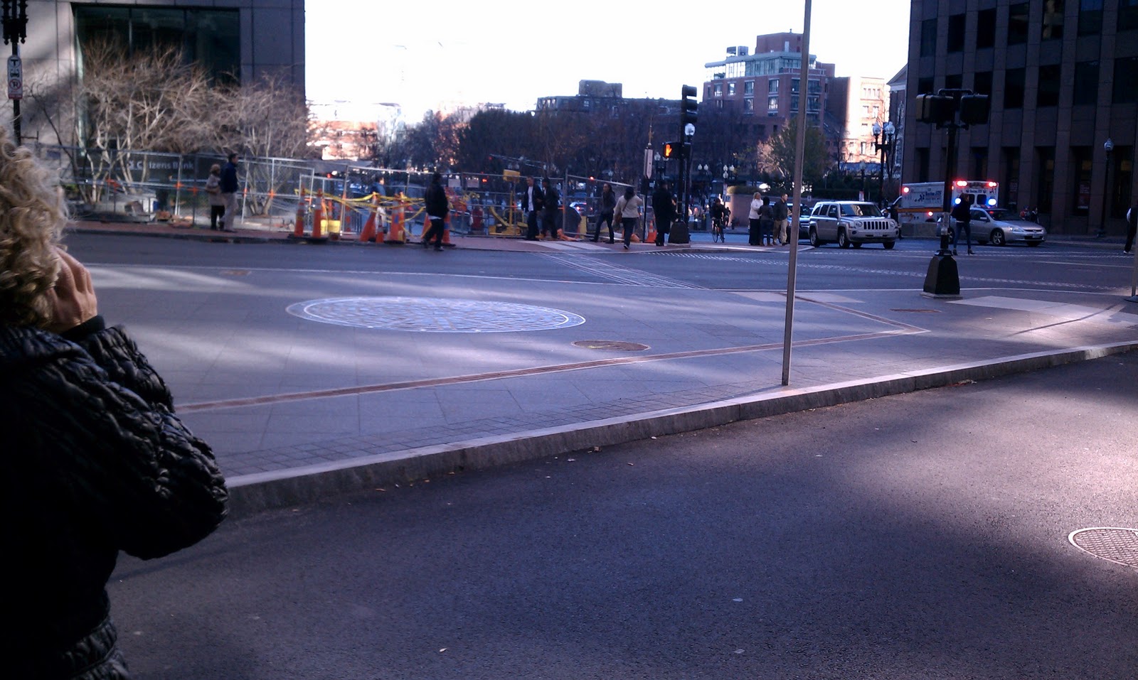 |
| 1. Looking toward Dock Square, across the site marker and State St. |
 |
| 2. The restored site marker, indicating the date of the massacre. |
 |
| 3. Looking up Devonshire St., corner of the Old State House at right. |
 |
| 4. Looking from the opposite vantage point, across Congres and down State St. |
The Location: State, Court, Washington, Devonshire, and Congress Streets, Boston, MA (Map).
Year of Urban Fabric Restoration: 2011.
The Story: We last focused on the positive influence of thoughtful intersection improvements early last year in discussing Alexander the Great Square in Roslindale, a place admittedly somewhat on the periphery of the city. We're now looking at the very heart of Boston - directly in front of the Old State House (built on the site of the original Town House) at the intersection of five different streets - and near the site of the Boston Massacre, one of the defining moments in the run-up to open hostilities in the American War for Independence. The Wikipedia entry linked here recounts the devolution of a relatively routine encounter in the street into calling out a small contingent of armed troops, to taunts and snowball/rock throwing by the frustrated local citizenry at the symbols of imperial power to the climax of the event - the undisciplined firing of weapons by the provoked soldiers into an unarmed crowd, resulting in the death of 5 Bostonians. It never ceases to amaze me that John Adams led the defendse of the 8 British soldiers who, after an investigation by the colonial authorities, were charged with murder - and managed to get 6 of them (including the corporal in charge, who had never ordered his contingent to fire) acquitted and 2 convicted of the lesser charge of manslaughter.
The site marker's location is somewhat inaccurate - it seems clear from the available record that the incident itself took place in front of the colonial-era custom house, which was down State Street (then King Street), closer to the harbor. But there is no doubt that the recent improvements at this intersection make it both a more fitting setting for the marker (which has itself been given a typically understated old school-Boston upgrade with the date and title information around the outside) and a much better pedestrian environment. I'm not sure when the area took on the God-awful street design that pushed a direct access lane from Congress Street to Devonshire Street within just a couple of feet from the Old State House's corner, though based on the Bromley Atlas plates available online, it was definitely after 1938. That seems about right to me. Most of the really bad street design/traffic engineering in the country took place in the immediate postwar period, when it seems the thought was that everything should be made easier for automobiles, flying cars were just around the corner and we certainly weren't going to be needing much in the way of walkable urban areas - at least at the ground level - in our bright, Jetsons-like future. So, what was the big deal if you isolated the Boston Massacre site marker and utterly stripped it of its context by sticking it in the middle of a pork-chop shaped traffic island? It wasn't long for this world anyway.
 |
| Credit: The Boston Globe. |
And as is the way with capital improvements, this bad decision-making proved long-lasting. It's been several decades now since Boston embraced its long and storied history as something that was important, worth preserving, and (above all) marketable. Even so, it wasn't until the MBTA decided to renovate State Street station, which underlies much of the intersection, about 5 years ago that the City was able to find the right opportunity to right this particular wrong and give everyone the opportunity to stop and reflect on this historic event without the fear of being run over at any minute. As someone who works in the building that looms, Vader-like, above the Old State House and thus comes through this particular part of Boston quite often, there is no question that this is a great improvement over the old layout, rationalizing the vehicular traffic pattern and expressing a clear preference for the huge volume of pedestrians - both residents and workers in Boston as well as our tourist friends from around the country and the world - who pass through here on a daily basis. It's just another example of small changes that are running in the right direction for a better experience for everyone who comes into contact with this city. More of this please.
RTUF sketch of the restored urban fabric: You'll have to forgive your correspondent for failing to property title the sketch. I've discovered since doing and scanning this sketch that the actual Boston Massacre Memorial is on Boston Common. This is only the site marker. - MJL

Sunday, November 13, 2011
Blog Post No. 2011-18: Anthony Flint fairly accurately summarizes the dilemma that is Jane Jacobs...
...and a challenge for us all
And so, the Jane Jacobs debate continues half a century on. And Anthony Flint makes a point in yesterday's Globe that reveals the running battle over her intellectual and practical legacy that looks more and more like the fight over the remains of a medieval saint than a 20th century author and activist. Your devoted RTUF correspondent has blogged here in the past about the planning and design professions' difficulty in deciding what her impact on the urban scene really was and whether it was good or bad. [For example: the post earlier this year on Frank Gruber's analysis.]
Anthony's latest piece - An urban legacy in need of renewal - brings the debate down to the level of the urban street, where the weapons of extreme skepticism and public involvement that Jacobs used to stop the disastrous, nested policies of urban renewal, "Get Things Done" Robert Moses-ism, untrammeled freeway expansion, and automobile-oriented "urban" planning have been turned, in a kind of twisted irony, on projects such as thoughtful infill developjment designed to advance the urban condition in ways that Jacobs would almost certainly favor. Thus, as Anthony notes, we have been recently treated to the depressing spectacle of women donning Jacobs wigs and glasses to oppose good urban infill in Brooklyn (and your correspondent's birthplace, to boot). Anthony is correct to observe that Jacobs' fundamentally anti-planning approach accordingly lives on, even when the profession is earnestly trying to do the right thing. It is undeniably distressing.
All of that said, I don't think for a second that we need more of the Moses way of doing things to balance out the universe. Being from a city so intimately shaped by the man that you literally can't go more than a couple of miles in any direction before coming across something he built or, more often, destroyed, I can emphatically state that unilateral, bureaucratic planning is best left dead and buried in this country. The real project is to help our fellow citizens be discerning observers and actors in both public and private development efforts. Given how awfully the built environment was treated in this country for more than half a century, it should surprise no one that there is virtually no faith that the next project is going to make things better. The first few rounds of this discussion will feel like a monologue. All we can hope is that eventually the message gets through and we demonstrate, through improved urban fabric, that there really is hope for something better.
Saturday, October 22, 2011
Blog Post No. 2011-17: What do you think it would take...
...to appropriately cap off Boston's Cathedral of the Holy Cross?
The Comment: As you can see from the photos, the Cathedral of the Holy Cross, although it's been open and in operation since 1875, was never quite "completed" to the design of P.C. Keeley, despite the plaque's statement to the contrary. It is very obviously missing the spires that should rise from the two towers on either side of the front facade. And so, RTUF's question today is as indicated above: What would it take to appropriately cap off those towers? And I mean that question both architecturally and practically. What should they look like -- traditional Gothic spires in the spirit of the original design (shown directly below, and, at least according to the accompanying account, planned to reach 200 and 300 feet in height, respectively), or something more modern? And practically, how would the archdiocese, no longer flush with cash or the level of influence and good will it used to enjoy in Boston, pull it off in the first place?
Now, this question occurs to me because I've spent several hours last Saturday and today attending mass at the Cathedral. I have done this not because the Cathedral is convenient to our house in Roslindale or because I'm looking for a new parish. Rather, my son's choir (based from the Boston Archdiocesan Choir School at St. Paul's Church in Cambridge) has sung at masses there the last two weekends. [Regular readers may recall that I blogged about the very flexible courtyard space at St. Paul's church earlier this year in Post No. 2011-2.]
So, I've spent more time there in the last 8 days than I've spent there in the last 14 years of living in the Boston area. Even as a pretty diligent, church-going Catholic, I'm not surprised. The Cathedral, almost since the day of its completion, appears to have occupied something of a disfavored place in the life and self-concept of the Boston archdiocese. This seems partly the result of its location in the South End, which was eclipsed as the most fashionable residential neighborhood in the city shortly after its completion when the filling and construction of the Back Bay got underway in the 1860s. It also seems partly the result of the leadership of the archdiocese's decision to affirmatively achieve the disconnect by decamping for Lake Street on the Brighton-Newton border starting in the 1880s. Under Archbishop Williams, the chancery (the central administrative offices), the archdiocesan seminary, and the archbishop's residence were all located out on the former Stanwood Estate by the turn of the last century, several miles from the place where worship was supposed to be centered. When Boston College, the region's most important Catholic higher educational institution, moved from its former location on Harrison Avenue (also in the South End and not far from the Cathedral) to an assemblage across Commonwealth Avenue from the archdiocese's new compound in the first decade of the 20th century, the relocation of Catholic Boston's power and attention was complete. I'd be curious to know if there is another example anywhere in the Catholic Church -- worldwide -- where the cathedral was so completely abandoned and cut off from the leadership of the diocese. The only thing the leadership appears to have left behind was Cathedral High School (the school gym is seen in Photo 5). And, then in the early 20th century, injury was added to insult as the elevated Orange Line was built down Washington Street, resulting in what Robert Campbell called "A Cathedral Trapped Behind an Iron Fence" in Cityscapes of Boston. So much, then, for the building that was supposed to be the main marker for the fully-arrived Catholic community in Boston.
 |
| Photo 1: Front facade of the cathedral. |
 |
| Photo 2: Close view of the lower front facade tower. |
 |
| Photo 3: A side view of the front facade, showing the low caps on the towers. |
 |
| Photo 4: The north side facade at the transept. |
 |
| Photo 5: View looking south along Washington Street, with Cathedral High School gym just in front of cathedral. |
 |
| Photo 6: Plaque on the front facade of the cathedral, referencing the importance of the building to newly-arrived Irish immigrants in the mid 19th century. |
The Comment: As you can see from the photos, the Cathedral of the Holy Cross, although it's been open and in operation since 1875, was never quite "completed" to the design of P.C. Keeley, despite the plaque's statement to the contrary. It is very obviously missing the spires that should rise from the two towers on either side of the front facade. And so, RTUF's question today is as indicated above: What would it take to appropriately cap off those towers? And I mean that question both architecturally and practically. What should they look like -- traditional Gothic spires in the spirit of the original design (shown directly below, and, at least according to the accompanying account, planned to reach 200 and 300 feet in height, respectively), or something more modern? And practically, how would the archdiocese, no longer flush with cash or the level of influence and good will it used to enjoy in Boston, pull it off in the first place?
 |
| Source: Boston Illustrated, 1881. |
Now, this question occurs to me because I've spent several hours last Saturday and today attending mass at the Cathedral. I have done this not because the Cathedral is convenient to our house in Roslindale or because I'm looking for a new parish. Rather, my son's choir (based from the Boston Archdiocesan Choir School at St. Paul's Church in Cambridge) has sung at masses there the last two weekends. [Regular readers may recall that I blogged about the very flexible courtyard space at St. Paul's church earlier this year in Post No. 2011-2.]
So, I've spent more time there in the last 8 days than I've spent there in the last 14 years of living in the Boston area. Even as a pretty diligent, church-going Catholic, I'm not surprised. The Cathedral, almost since the day of its completion, appears to have occupied something of a disfavored place in the life and self-concept of the Boston archdiocese. This seems partly the result of its location in the South End, which was eclipsed as the most fashionable residential neighborhood in the city shortly after its completion when the filling and construction of the Back Bay got underway in the 1860s. It also seems partly the result of the leadership of the archdiocese's decision to affirmatively achieve the disconnect by decamping for Lake Street on the Brighton-Newton border starting in the 1880s. Under Archbishop Williams, the chancery (the central administrative offices), the archdiocesan seminary, and the archbishop's residence were all located out on the former Stanwood Estate by the turn of the last century, several miles from the place where worship was supposed to be centered. When Boston College, the region's most important Catholic higher educational institution, moved from its former location on Harrison Avenue (also in the South End and not far from the Cathedral) to an assemblage across Commonwealth Avenue from the archdiocese's new compound in the first decade of the 20th century, the relocation of Catholic Boston's power and attention was complete. I'd be curious to know if there is another example anywhere in the Catholic Church -- worldwide -- where the cathedral was so completely abandoned and cut off from the leadership of the diocese. The only thing the leadership appears to have left behind was Cathedral High School (the school gym is seen in Photo 5). And, then in the early 20th century, injury was added to insult as the elevated Orange Line was built down Washington Street, resulting in what Robert Campbell called "A Cathedral Trapped Behind an Iron Fence" in Cityscapes of Boston. So much, then, for the building that was supposed to be the main marker for the fully-arrived Catholic community in Boston.
But the tides against which the Cathedral swam for many decades seem to be receding, at least in some directions. As Campbell noted in Cityscapes, the elevated Orange Line was torn down in the 1980s when the subway was relocated to a new alignment in the Southwest Corridor. The South End has become a far more fashionable and desired urban neighborhood in the last several decades. Washington Street itself has substantially recoverd, as new construction to the north of the Cathedral has filled in major gaps in the urban fabric and the MBTA, City of Boston, and the Commonwealth recently collaborated on a reconstruction of the thoroughfare that improved the streetscape and provided for reserved bus lanes for the Silver Line's southern segment (they're the red-painted lanes seen in Photo 5). The archdiocese itself has undergone a major transformation as a result of several trends over the last half century, including, most significantly, the twin traumas of parish closings/consolidations and the clergy abuse scandal that directly led to selling off most of the old Lake Street complex to Boston College as a way to shore up the archdiocese's finances. The current archbishop and cardinal, Sean O'Malley, now resides next to the Cathedral (a move your faithful correspondent heartily applauds), while the chancery has been moved to suburban office space in Braintree and the seminary remains in Brighton.
Accordingly, a new day has, in many ways, arrived in the archdiocese and we are all -- leadership, clergy, laity -- feeling our way through it. It seems, to at least this observer, that one tremendously important symbol of really starting a new era might be to complete unfinished business with what remains, at least spiritually, the most important building in the archdiocese's built heritage. Why not give the old edifice something new to make it really stand out? Why not figure out a way to have the towers (however conceived) finally reach into the sky the way they were meant? Why not announce that the archdiocese really and truly is back, in and of the City?
Editor's Note: This post has been edited for flow and to correct spelling and punctuation since its original posting. -- MJL
Saturday, October 15, 2011
Blog Post No. 2011-16: MGH creates an enhanced front door on Cambridge Street...
...using a new museum of medical history and innovation as the catalyst.
Year of Urban Fabric Restoration: 2011.
The Story: This one kind of came out of nowhere. Your RTUF correspondent prides himself on keeping up to date on what is being built and where here in the Hub. But I didn't notice this until I happened to be walking up Cambridge Street a couple weeks ago. It's an arresting building, quite different from just about everything up and down the street -- all copper sheathing and glass curtain wall with a triangular overhang at the second level. Not a shred of red brick on it. I reckon that only Mass. General could really get away with doing this here, considering that, you know, Mass. General has been around since this part of Boston turned from a portion of the very wet Back Bay/Charles River estuary into dry land. That goes all the way back to 1823, when the Bulfinch Building (designed by perhaps the old town's most beloved architect) was completed eleven years after The General Hospital corporation was created by a special act of the Massachusetts General Court. "MGH" as it is known around Boston needs practically no introduction almost anywhere. It was, in fact, in the so-called "Ether Dome" that the first surgical operation using general anesthetic (in that case, ether) was conducted in 1846 and popularized rapidly, MGH's chief of surgery, John Collins Warren, declaring to those in attendance that "Gentlemen, this is no humbug." And so, it is fitting that MGH should have a museum of medical history and innovation. And it is also fitting that the building should be a bit splashy at this corner, which is really MGH's front door. The extension of the street wall here is incremental - the old resident physicians' building wasn't that far back from the street. But the shielding of the multi-level garage behind is considerably better than before. Combined with the improvements already noted at this weblog to Charles River Plaza and the Saltonstall Building, we can see that Cambridge Street continues on the urban design upswing. A couple more of the gaps filled in and we'll have a real boulevard to be proud of. Patience and appropriately tempered expectations are truly virtues.
RTUF Sketch of the Restored Urban Fabric: The existing Physicians' Residence building wasn't bad, but it really didn't provide the kind of on-the-street experience that the new building does. And it did precious little to shield the garage structure behind.

 |
| Photo 1: Looking from across Cambridge Street. |
 |
| Photo 2: The gap between the Resident Physicians Building. |
 |
| Photo 3: Looking toward Charles Circle. |
The Location: 38 North Grove Street (at Cambridge Street), Boston's West End.
Year of Urban Fabric Restoration: 2011.
The Story: This one kind of came out of nowhere. Your RTUF correspondent prides himself on keeping up to date on what is being built and where here in the Hub. But I didn't notice this until I happened to be walking up Cambridge Street a couple weeks ago. It's an arresting building, quite different from just about everything up and down the street -- all copper sheathing and glass curtain wall with a triangular overhang at the second level. Not a shred of red brick on it. I reckon that only Mass. General could really get away with doing this here, considering that, you know, Mass. General has been around since this part of Boston turned from a portion of the very wet Back Bay/Charles River estuary into dry land. That goes all the way back to 1823, when the Bulfinch Building (designed by perhaps the old town's most beloved architect) was completed eleven years after The General Hospital corporation was created by a special act of the Massachusetts General Court. "MGH" as it is known around Boston needs practically no introduction almost anywhere. It was, in fact, in the so-called "Ether Dome" that the first surgical operation using general anesthetic (in that case, ether) was conducted in 1846 and popularized rapidly, MGH's chief of surgery, John Collins Warren, declaring to those in attendance that "Gentlemen, this is no humbug." And so, it is fitting that MGH should have a museum of medical history and innovation. And it is also fitting that the building should be a bit splashy at this corner, which is really MGH's front door. The extension of the street wall here is incremental - the old resident physicians' building wasn't that far back from the street. But the shielding of the multi-level garage behind is considerably better than before. Combined with the improvements already noted at this weblog to Charles River Plaza and the Saltonstall Building, we can see that Cambridge Street continues on the urban design upswing. A couple more of the gaps filled in and we'll have a real boulevard to be proud of. Patience and appropriately tempered expectations are truly virtues.
RTUF Sketch of the Restored Urban Fabric: The existing Physicians' Residence building wasn't bad, but it really didn't provide the kind of on-the-street experience that the new building does. And it did precious little to shield the garage structure behind.

Friday, September 30, 2011
Blog Post No. 2011-15: Reflecting on Bryant Park's lofty status and making the case...
...for Adams Park here in our own Roslindale Square
Greetings RTUF Heroes! For our second-half-of-the-month post, we here in the RTUF command center will begin by reminiscing about the bad old days in Bryant Park. It seems that our friends over at Planetizen are holding an on-line poll for the 100 Top Public Spaces in the U.S. The winners will be announced on October 20. At least as of this posting, you'll see that Bryant Park appears to running in first. That this is so is a stunning reversal of its fortunes of 20+ years ago. Well do I remember working as a young lad at the the big city's Regional Plan Association, which was then at 40th and 6th, and enjoying my lunch in the park on sunny days just a block away despite the drug pushers and assorted undesirable characters. Though far less populated and used than it is now in the flower of its resurgence, even in the late 1980s, you could tell that the park, like much of New York at the time, had great bones and probably had more foot traffic and activity than 95% of the public spaces in the US even in its fallen state. It was somewhat difficult back then to imagine the transformation that the park would undergo, yet it has. And the city is clearly the better for it. In a sense, the more incredible thing is that such a centrally located and well-positioned park -- directly behind the gorgeous McKim Mead & White-designed New York Public Library main branch -- could ever have been allowed to descend to such a lowly level.
And so, dear readers, for what it's worth, I will be nominating Adams Park here in Roslindale as one of the 100 great places in the U.S. I do this not because it is perfect -- it isn't. It could be more pedestrian friendly on its periphery, it suffers from a complicated traffic pattern on the surrounding streets, and it doesn't get all that much spontaneous activity. Instead, what succeeds generally has to be programmed. But there is no question that this place has been the ideal setting for the vastly improved Roslindale Farmers Market for the last several years. The park gets my nod for that alone, but also for the straightforward landscape design, high level of maintenance that the City has kept up over the years, the multiple understated war memorials, and also, you know, as a way of showing a little plain old hometown pride. Herewith, some photos of Adams Park clipped from other places on the web (with credits as indicated):
| Credit: West Roxbury Patch. |
 |
| Credit: Yelp.com. |
 |
| Credit: Roslindale.net. |
| Credit: Kennedy School of Government website. |
Thursday, September 15, 2011
Blog Post No. 2011-14: Shedding light on the boiler room...
...has to be one of the keys to making it at least potentially rentable in today's economy
 |
| 1 - Looking down Federal to Franklin Street. |
 |
| 2 - Looking from the corner of Franklin and Federal. |
 |
| 3 - Looking up from Federal Street. |
The Location: One Federal Street, Boston, MA.
Year of Urban Fabric Restoration: 2011.
The Story: As the economy continues its slow recovery, we have another of those small, incremental changes here, and one that doesn't even rate a RTUF sketch because there is no hole being filled in this time. What we do have, however, is a rather helpful daylighting of what used to be the "boiler room" space at One Federal Street. This 39-story skyscraper was built in 1975 as the headquarters for Shawmut Bank. Back in the day, a headquarters bank building like this filled its lower floors with back office services and gave the upper floors to the executive ranks. When it was built, One Federal didn't even bother giving the first three floors above the lobby atrium windows. Instead, those floors were a solid slab of concrete curtain wall all the way around the block. Working in there must have been a fairly grim existence. Fast forward 36 years, and the back office space is now long gone, as is Shawmut Bank (having been gobbled up by Fleet Bank in the mid-1990s, and FleetBoston (resulting from the merger of Fleet with the First National Bank of Boston) was itself gobbled up by Bank of America in 2004). The kinds of functions that used to occupy floors 5-7 migrated out into the region's suburbs long ago. So, Tishman Speyer, the building's owners, have apparently decided that they aren't going to find anyone willing to take the space unless they give it at least daylight, even if they can't give it soaring views. It's hard to picture this space occupied even in boom times, and we are definitely not in boom times. Hence, in the last several months, up went the scaffolding and out came the concrete, replaced now by three stories of windows. I'm somewhat intrigued by the fact that Tishman doesn't seem to have a tenant signed up for the space they've suddenly greatly improved (landlords don't typically make money by making improvements to space that isn't occupied or about to be occupied by a tenant who will flow some cash). But I thank them anyway for opening up the lower floors of the building. Even though it's not at the street level, replacing the blank walls with windows is a step in the right direction and adds to the streetscape on all four sides of the building.
Wednesday, August 31, 2011
Blog Post No. 2011-13: Food trucks as a temporary piece of urban fabric...
...not a bad idea at all

 |
| Photo 1: Three food trucks, looking toward Dock Square. |
 |
| Photo 2: Looking over the trucks toward Faneuil Hall. |
 |
| Photo 3: Down the stairs toward Dock Square. |
 |
| Photo 4: Informal outdoor seating and dining. |
The Location: Boston City Hall Plaza, above Dock Square.
Year of Urban Fabric Restoration: 2011.
The Story: A short post, here at the end of August and a VERY fine week of weather following the arrival and rapid departure of former Hurricane/Tropical Storm Irene. The food trucks have been located here since the spring, but your faithful correspondent only had the inclination and opportunity to visit earlier this month. I had a late lunch at the Clover truck, which was one of the first food trucks to hit the streets here in Boston and has been parked at various locations around the Greenway over the last year. How to animate City Hall Plaza has been a problem for the City since it was first bestowed up on the populace 40 years ago, a topic on which this blogger has commented in the past (See Post No. 2011-6). Relatively isolated portions of the plaza, such as this, have been the most difficult to animate, cut off as they are. That the Mayor's administration has found a way to bring them some life, even on only a seasonal basis, is testament to the level of sustained attention that is now being paid here. There is a part of me that hopes that structural accretion may someday transform these temporary visitors into permanent occupants. Who can say what the future holds? But even if we have activity only for certain months, it is unquestionably an improvement.
RTUF Sketch of the Restored Urban Fabric: You can file this one under changes at the margins (and much more is needed). RTUF stipulates that 3 food trucks tucked away in what amounts to a corner doesn't make this the Piazza San Marco, but it is decidedly better.

Friday, July 15, 2011
Blog Post No. 2011-12: Boylston Street in the Fenway...
...it just keeps getting better
This one is another of our media commentaries here at RTUF ("They report it, we give it the once over..."), though this time the media is actually just doing RTUF's work for it. [Thank you, Media!!!] First, it was Russ with the pictures in the last entry, now it's the real estate beat reporter in the relatively recent pages of The Boston Globe talking about the remarkable restoration of the urban fabric along a thoroughfare that as recently as the early part of the last decade felt like a fairly dated and poorly designed suburban strip dropped in the very heart of the city. Not so anymore. In his piece from last Thursday's edition entitled "Fenway facelift continues," Casey Ross traces the two major new developments (plus the Jerry Remy/Guitar Center rehab that has been a huge hit (pun intended)) that have begun to create the active streetscape and walkable development on Boylston Street envisioned in 2004 when the City adopted a new neighborhood zoning article for the area after several years of strategic planning and visioning for the ballpark and its surrounding area. The Globe even includes, dare we say it (!), a RTUF-like little graphic showing how the most recent developments have filled in the street wall and started to make a real, respectable urban boulevard. And like RTUF, they aren't giving the McDonald's site redevelopers any credit until they actually put the building down on the site:..
Additional comment: In thinking a bit more about this post over the weekend, one additional comment seems in order. The almost-immediate decision made by the Henry/Lucchino ownership group to keep Fenway Park instead of tearing it down and building an imitation next door (as had been proposed by the prior ownership group) has made a huge difference to the neighborhood. Starting in 2003, the ballpark has undergone a series of carefully conceived and brilliantly executed renovations under the leadership of architect Janet Marie Smith that have enlarged the seating capacity from 33,000 to over 39,000 and, simultaneously, given the park a better look and feel. The Wikipedia entry lists them here and I will say for the record that in my opinion the best of them was taking down the windows on what was the .406 Club. I say in there once with a friend from law school and it was one of the more disconnected experiences I've ever had watching a sporting event in person. I mean, the crowd sounds had to be piped in because you were behind this wall of glass, sitting directly above home plate. Fenway Park can and should be many things, but antiseptic is decidedly not one of them. So, instead of enduring the upheaveal of moving the ballpark for little practical gain (and a lot of loss in terms of continuity and authenticity), the neighborhood has seen its most famous asset cared for and polished to look the best it may have ever looked, and Boylston Street just keeps getting better...
This one is another of our media commentaries here at RTUF ("They report it, we give it the once over..."), though this time the media is actually just doing RTUF's work for it. [Thank you, Media!!!] First, it was Russ with the pictures in the last entry, now it's the real estate beat reporter in the relatively recent pages of The Boston Globe talking about the remarkable restoration of the urban fabric along a thoroughfare that as recently as the early part of the last decade felt like a fairly dated and poorly designed suburban strip dropped in the very heart of the city. Not so anymore. In his piece from last Thursday's edition entitled "Fenway facelift continues," Casey Ross traces the two major new developments (plus the Jerry Remy/Guitar Center rehab that has been a huge hit (pun intended)) that have begun to create the active streetscape and walkable development on Boylston Street envisioned in 2004 when the City adopted a new neighborhood zoning article for the area after several years of strategic planning and visioning for the ballpark and its surrounding area. The Globe even includes, dare we say it (!), a RTUF-like little graphic showing how the most recent developments have filled in the street wall and started to make a real, respectable urban boulevard. And like RTUF, they aren't giving the McDonald's site redevelopers any credit until they actually put the building down on the site:..
 |
| Sources: BRA, Boston Globe. |
Additional comment: In thinking a bit more about this post over the weekend, one additional comment seems in order. The almost-immediate decision made by the Henry/Lucchino ownership group to keep Fenway Park instead of tearing it down and building an imitation next door (as had been proposed by the prior ownership group) has made a huge difference to the neighborhood. Starting in 2003, the ballpark has undergone a series of carefully conceived and brilliantly executed renovations under the leadership of architect Janet Marie Smith that have enlarged the seating capacity from 33,000 to over 39,000 and, simultaneously, given the park a better look and feel. The Wikipedia entry lists them here and I will say for the record that in my opinion the best of them was taking down the windows on what was the .406 Club. I say in there once with a friend from law school and it was one of the more disconnected experiences I've ever had watching a sporting event in person. I mean, the crowd sounds had to be piped in because you were behind this wall of glass, sitting directly above home plate. Fenway Park can and should be many things, but antiseptic is decidedly not one of them. So, instead of enduring the upheaveal of moving the ballpark for little practical gain (and a lot of loss in terms of continuity and authenticity), the neighborhood has seen its most famous asset cared for and polished to look the best it may have ever looked, and Boylston Street just keeps getting better...
Thursday, June 30, 2011
Blog Post No. 2011-11: Liberty Wharf is as advertised...
...no question
The Photos: All credited to Russ Preston.
The Location: Liberty Wharf, 242 Northern Avenue, South Boston Waterfront (aka The Seaport District), Boston, MA (Map)
Year of Urban Fabric Restoration: 2010.
The Story: In this case, less is actually more. This location was formerly Jimmy's Harborside. Having never eaten at Jimmy's I can't comment on the food. But there is no question that its demise laid the groundwork for an urban design upgrade of the first order. Compare the pictures above to this:
![]()
Certainly iconic. Well known as a Boston tradition. Yet distinctly lacking as it met the street. In its last iteration, the Jimmy's building was a single continuous frontage that gave you almost no sense that Boston Harbor was, you know, just behind it. The new design, from Elkus Manfredi, breaks open the site into 3 structures, wraps the Harborwalk around the water side and lets even those walking by on the street side know that the waterfront is really there. I confess that I hadn't really thought to go check out the location until Brian McGrory wrote a typically worthwhile column in the Boston Globe a week ago on what a success it's turning out to be: "Waterfront hits its stride." With such an endorsement, I made a mental note to see what the fuss was all about the next time an opportunity arose. So when fellow CNUer and urban designer Russ Preston came up from Providence for lunch earlier this week, we went over to Legal Sea Food's new Harborside 1. It was a nice day, if somewhat hazy, so the doors out to the harbor and the boat slips a level down were all wide open. In summer, exactly the way it should be. In the true spirit of RTUF's taking whatever we're given: although RTUF's photo apparatus was deployed, Russ' pictures were just that much better, so that's what we have. We here at RTUF highly recommend a visit yourself if you're here in town or come to visit anytime soon. If the rest of the redeveloped waterfront works this well, we will be lucky indeed.
RTUF Sketch of the Restored Urban Fabric: RTUF was spared the effort this time as the project architects, Elkus Manfredi, have a handy series of images, including a site plan, here. And Liberty Wharf itself even has a blog, check it out here.
The Photos: All credited to Russ Preston.
 |
| Photo 1: Looking east, with Legal Harborside 1 to the right. |
 |
| Photo 2: Looking around the corner of the western building into the harbor. |
 |
| Photo 3: Legal Harborside from across Northern Avenue. |
 |
| Photo 4: Detail of the second floor, street side on the western building. |
 |
| Photo 5: Up close on the streetscape. |
 |
| Photo 6: One of the few new buildings in the area not clad in pre-cast concrete panels. |
 |
| Photo 6: Looking between the buildings. |
 |
| Photo 7: Looking west along the water, back toward downtown Boston. |
Year of Urban Fabric Restoration: 2010.
The Story: In this case, less is actually more. This location was formerly Jimmy's Harborside. Having never eaten at Jimmy's I can't comment on the food. But there is no question that its demise laid the groundwork for an urban design upgrade of the first order. Compare the pictures above to this:

Certainly iconic. Well known as a Boston tradition. Yet distinctly lacking as it met the street. In its last iteration, the Jimmy's building was a single continuous frontage that gave you almost no sense that Boston Harbor was, you know, just behind it. The new design, from Elkus Manfredi, breaks open the site into 3 structures, wraps the Harborwalk around the water side and lets even those walking by on the street side know that the waterfront is really there. I confess that I hadn't really thought to go check out the location until Brian McGrory wrote a typically worthwhile column in the Boston Globe a week ago on what a success it's turning out to be: "Waterfront hits its stride." With such an endorsement, I made a mental note to see what the fuss was all about the next time an opportunity arose. So when fellow CNUer and urban designer Russ Preston came up from Providence for lunch earlier this week, we went over to Legal Sea Food's new Harborside 1. It was a nice day, if somewhat hazy, so the doors out to the harbor and the boat slips a level down were all wide open. In summer, exactly the way it should be. In the true spirit of RTUF's taking whatever we're given: although RTUF's photo apparatus was deployed, Russ' pictures were just that much better, so that's what we have. We here at RTUF highly recommend a visit yourself if you're here in town or come to visit anytime soon. If the rest of the redeveloped waterfront works this well, we will be lucky indeed.
RTUF Sketch of the Restored Urban Fabric: RTUF was spared the effort this time as the project architects, Elkus Manfredi, have a handy series of images, including a site plan, here. And Liberty Wharf itself even has a blog, check it out here.
Saturday, June 4, 2011
Blog Post No. 2011-10: Block 89, Madison, WI
Redevelopment requires patience, my friends...
Location: Block 89 (bounded by East Main, South Pinckney, East Doty, and King streets), Madison, Wisconsin
Map and Images: Here and here.
The Story: So, your faithful RTUF correspondent has been out in Madison, WI, for CNU 19 for the last couple of days. It's been fun reconnecting with the NUers from outside of New England (and even a few of my fellow regional denizens). I'm leaving a bit early and so going to miss the "Mano-a-Mano at Monona," a.k.a., the Saturday evening plenary that will close the Congress in which Andres Duany and Charles Waldheim will discuss what New Urbanism and Landscape Urbanism. As a quick aside here, I have almost lived up to my promise to read the Landscape Urbanism Reader and give you, RTUF's vast and influential readership, my own personal take on the NU-LU dispute. Loook for that dispatch in the next couple of weeks.
But, to return to the title of this post: we are stepping outside of the Boston focus of the blog today to highlight the great, but painstaking work that was required to turn a piece of once-failing urban fabric in the heart of Madison into a great urban block -- Block 89. I went to a session this morning on financing mixed-use, pedestrian-oriented projects and heard Thomas Neujahr, one of the principals of Urban Land Interests, the project's developer, walk through the project's complex financing and buildout approach, which used a combination of municipal tax increment financing, and a redevelopment district plus patient and carefully considered phasing over a 20-year period, starting in the mid-1980s at pretty much the nadir of downtown-located retail and mixed-use in Madison as well as the country as a whole. His presentation included aerial before and after photos of the block that I will post as soon as I can access the dropbox where the presentation has been uploaded.
Madison, by the way, is a great town. The area between the two lakes and focusing on the State Capitol and the University of Wisconsin's main campus was built out on a plan by John Nolen. The standard grid is broken by 4 radials centered on the capitol building that give the overall layout of the city a dintinctive character and focus. Since today is the opening day for Roslindale Square's seasonal farmer's market, it is worth noting that they have a very massive farmer's market -- the Dane County Farmer's Market -- on Saturdays that goes all the way around the state capitol on 4 sides. It's got to be the one of the biggest markets of its kind in the US, if not the biggest. Some photos here:
 |
| Photo 1: Bee stall with vendor and beehive hat. |
 |
| Photo 2: Picked up some 8-year aged Wisconsin cheddar here. |
 |
| Photo 3: It's pretty much a one-way loop all the way around. |
 |
| Photo 4: They close off King from the capitol for a couple blocks. Block 89 is in the background. |
 |
| Photo 5: This was some kind of a pie or other pastry eating contest featuring younger women in beauty contestant tiaras and sashes. Not sure what the guy with the cheesehead hat was doing. |
Subscribe to:
Posts (Atom)

