Friday, November 25, 2011

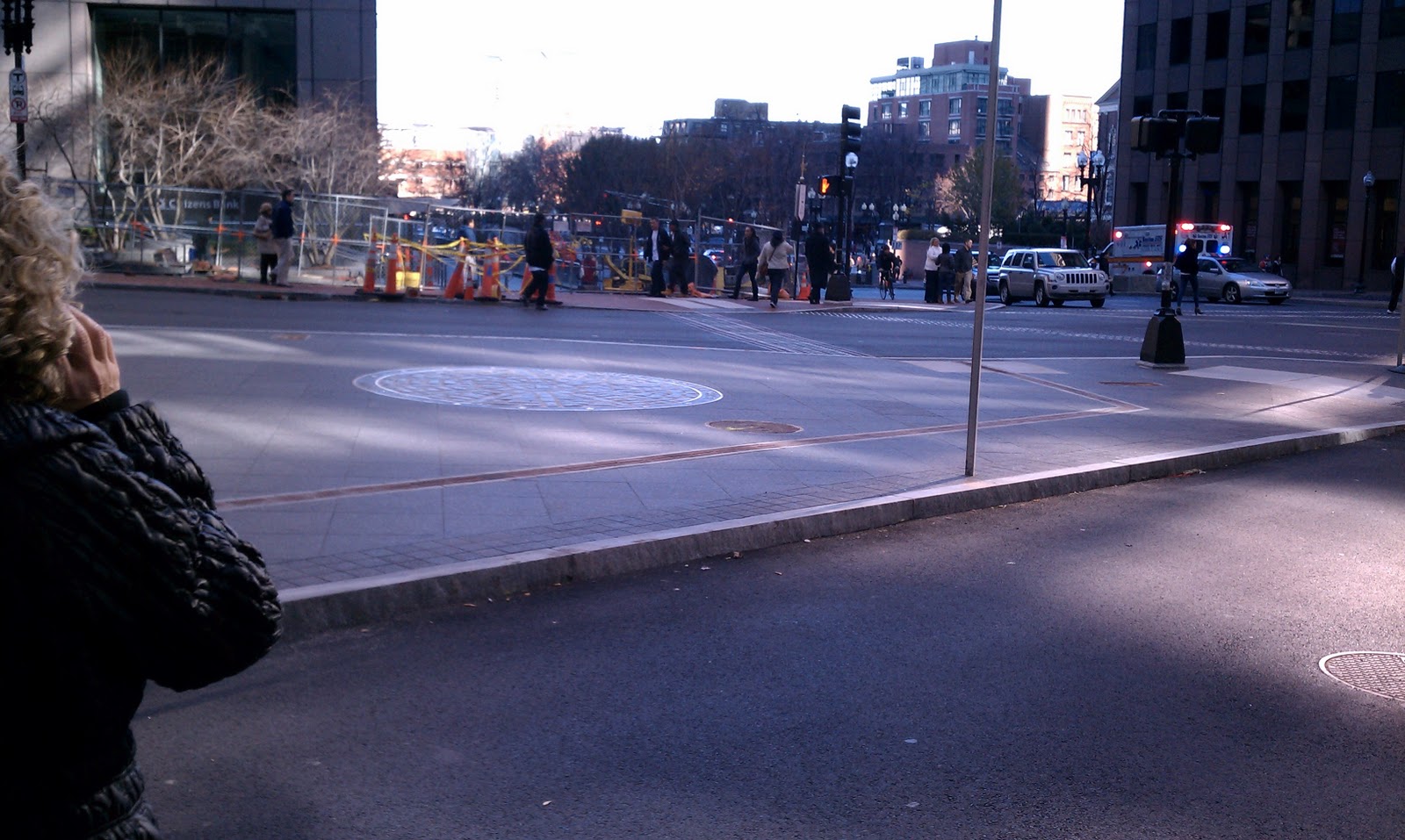
Blog Post No. 2011-19: The Boston Massacre Site Marker finally gets some respect...

...and we all get a much better intersection at State, Court, Washington, Devonshire, and Congress Streets.

1. Looking toward Dock Square, across the site marker and State St.

2. The restored site marker, indicating the date of the massacre.

3. Looking up Devonshire St., corner of the Old State House at right.

4. Looking from the opposite vantage point, across Congres and down State St.

The Location: State, Court, Washington, Devonshire, and Congress Streets, Boston, MA (Map).

Year of Urban Fabric Restoration: 2011.

The Story: We last focused on the positive influence of thoughtful intersection improvements early last year in discussing Alexander the Great Square in Roslindale, a place admittedly somewhat on the periphery of the city. We're now looking at the very heart of Boston - directly in front of the Old State House (built on the site of the original Town House) at the intersection of five different streets - and near the site of the Boston Massacre, one of the defining moments in the run-up to open hostilities in the American War for Independence. The Wikipedia entry linked here recounts the devolution of a relatively routine encounter in the street into calling out a small contingent of armed troops, to taunts and snowball/rock throwing by the frustrated local citizenry at the symbols of imperial power to the climax of the event - the undisciplined firing of weapons by the provoked soldiers into an unarmed crowd, resulting in the death of 5 Bostonians. It never ceases to amaze me that John Adams led the defendse of the 8 British soldiers who, after an investigation by the colonial authorities, were charged with murder - and managed to get 6 of them (including the corporal in charge, who had never ordered his contingent to fire) acquitted and 2 convicted of the lesser charge of manslaughter.

The site marker's location is somewhat inaccurate - it seems clear from the available record that the incident itself took place in front of the colonial-era custom house, which was down State Street (then King Street), closer to the harbor. But there is no doubt that the recent improvements at this intersection make it both a more fitting setting for the marker (which has itself been given a typically understated old school-Boston upgrade with the date and title information around the outside) and a much better pedestrian environment. I'm not sure when the area took on the God-awful street design that pushed a direct access lane from Congress Street to Devonshire Street within just a couple of feet from the Old State House's corner, though based on the Bromley Atlas plates available online, it was definitely after 1938. That seems about right to me. Most of the really bad street design/traffic engineering in the country took place in the immediate postwar period, when it seems the thought was that everything should be made easier for automobiles, flying cars were just around the corner and we certainly weren't going to be needing much in the way of walkable urban areas - at least at the ground level - in our bright, Jetsons-like future. So, what was the big deal if you isolated the Boston Massacre site marker and utterly stripped it of its context by sticking it in the middle of a pork-chop shaped traffic island? It wasn't long for this world anyway.

Credit: The Boston Globe.

And as is the way with capital improvements, this bad decision-making proved long-lasting. It's been several decades now since Boston embraced its long and storied history as something that was important, worth preserving, and (above all) marketable. Even so, it wasn't until the MBTA decided to renovate State Street station, which underlies much of the intersection, about 5 years ago that the City was able to find the right opportunity to right this particular wrong and give everyone the opportunity to stop and reflect on this historic event without the fear of being run over at any minute. As someone who works in the building that looms, Vader-like, above the Old State House and thus comes through this particular part of Boston quite often, there is no question that this is a great improvement over the old layout, rationalizing the vehicular traffic pattern and expressing a clear preference for the huge volume of pedestrians - both residents and workers in Boston as well as our tourist friends from around the country and the world - who pass through here on a daily basis. It's just another example of small changes that are running in the right direction for a better experience for everyone who comes into contact with this city. More of this please.

RTUF sketch of the restored urban fabric: You'll have to forgive your correspondent for failing to property title the sketch. I've discovered since doing and scanning this sketch that the actual Boston Massacre Memorial is on Boston Common. This is only the site marker. - MJL

Sunday, November 13, 2011

Blog Post No. 2011-18: Anthony Flint fairly accurately summarizes the dilemma that is Jane Jacobs...

...and a challenge for us all

And so, the Jane Jacobs debate continues half a century on. And Anthony Flint makes a point in yesterday's Globe that reveals the running battle over her intellectual and practical legacy that looks more and more like the fight over the remains of a medieval saint than a 20th century author and activist. Your devoted RTUF correspondent has blogged here in the past about the planning and design professions' difficulty in deciding what her impact on the urban scene really was and whether it was good or bad. [For example: the post earlier this year on Frank Gruber's analysis.]

Anthony's latest piece - An urban legacy in need of renewal - brings the debate down to the level of the urban street, where the weapons of extreme skepticism and public involvement that Jacobs used to stop the disastrous, nested policies of urban renewal, "Get Things Done" Robert Moses-ism, untrammeled freeway expansion, and automobile-oriented "urban" planning have been turned, in a kind of twisted irony, on projects such as thoughtful infill developjment designed to advance the urban condition in ways that Jacobs would almost certainly favor. Thus, as Anthony notes, we have been recently treated to the depressing spectacle of women donning Jacobs wigs and glasses to oppose good urban infill in Brooklyn (and your correspondent's birthplace, to boot). Anthony is correct to observe that Jacobs' fundamentally anti-planning approach accordingly lives on, even when the profession is earnestly trying to do the right thing. It is undeniably distressing.

All of that said, I don't think for a second that we need more of the Moses way of doing things to balance out the universe. Being from a city so intimately shaped by the man that you literally can't go more than a couple of miles in any direction before coming across something he built or, more often, destroyed, I can emphatically state that unilateral, bureaucratic planning is best left dead and buried in this country. The real project is to help our fellow citizens be discerning observers and actors in both public and private development efforts. Given how awfully the built environment was treated in this country for more than half a century, it should surprise no one that there is virtually no faith that the next project is going to make things better. The first few rounds of this discussion will feel like a monologue. All we can hope is that eventually the message gets through and we demonstrate, through improved urban fabric, that there really is hope for something better.

Saturday, October 22, 2011

Blog Post No. 2011-17: What do you think it would take...

...to appropriately cap off Boston's Cathedral of the Holy Cross?

Photo 1: Front facade of the cathedral. 

Photo 2: Close view of the lower front facade tower.

Photo 3: A side view of the front facade,
showing the low caps on the towers.

Photo 4: The north side facade at the transept.

Photo 5: View looking south along Washington Street,
with Cathedral High School gym just in front of cathedral.

Photo 6: Plaque on the front facade of the cathedral,
referencing the importance of the building to
newly-arrived Irish immigrants in the mid 19th century.

The Comment: As you can see from the photos, the Cathedral of the Holy Cross, although it's been open and in operation since 1875, was never quite "completed" to the design of P.C. Keeley, despite the plaque's statement to the contrary. It is very obviously missing the spires that should rise from the two towers on either side of the front facade. And so, RTUF's question today is as indicated above: What would it take to appropriately cap off those towers? And I mean that question both architecturally and practically. What should they look like -- traditional Gothic spires in the spirit of the original design (shown directly below, and, at least according to the accompanying account, planned to reach 200 and 300 feet in height, respectively), or something more modern? And practically, how would the archdiocese, no longer flush with cash or the level of influence and good will it used to enjoy in Boston, pull it off in the first place?

Source: Boston Illustrated, 1881.

Now, this question occurs to me because I've spent several hours last Saturday and today attending mass at the Cathedral. I have done this not because the Cathedral is convenient to our house in Roslindale or because I'm looking for a new parish. Rather, my son's choir (based from the Boston Archdiocesan Choir School at St. Paul's Church in Cambridge) has sung at masses there the last two weekends. [Regular readers may recall that I blogged about the very flexible courtyard space at St. Paul's church earlier this year in Post No. 2011-2.]

So, I've spent more time there in the last 8 days than I've spent there in the last 14 years of living in the Boston area. Even as a pretty diligent, church-going Catholic, I'm not surprised. The Cathedral, almost since the day of its completion, appears to have occupied something of a disfavored place in the life and self-concept of the Boston archdiocese. This seems partly the result of its location in the South End, which was eclipsed as the most fashionable residential neighborhood in the city shortly after its completion when the filling and construction of the Back Bay got underway in the 1860s. It also seems partly the result of the leadership of the archdiocese's decision to affirmatively achieve the disconnect by decamping for Lake Street on the Brighton-Newton border starting in the 1880s. Under Archbishop Williams, the chancery (the central administrative offices), the archdiocesan seminary, and the archbishop's residence were all located out on the former Stanwood Estate by the turn of the last century, several miles from the place where worship was supposed to be centered. When Boston College, the region's most important Catholic higher educational institution, moved from its former location on Harrison Avenue (also in the South End and not far from the Cathedral) to an assemblage across Commonwealth Avenue from the archdiocese's new compound in the first decade of the 20th century, the relocation of Catholic Boston's power and attention was complete. I'd be curious to know if there is another example anywhere in the Catholic Church -- worldwide -- where the cathedral was so completely abandoned and cut off from the leadership of the diocese. The only thing the leadership appears to have left behind was Cathedral High School (the school gym is seen in Photo 5). And, then in the early 20th century, injury was added to insult as the elevated Orange Line was built down Washington Street, resulting in what Robert Campbell called "A Cathedral Trapped Behind an Iron Fence" in Cityscapes of Boston. So much, then, for the building that was supposed to be the main marker for the fully-arrived Catholic community in Boston.

But the tides against which the Cathedral swam for many decades seem to be receding, at least in some directions. As Campbell noted in Cityscapes, the elevated Orange Line was torn down in the 1980s when the subway was relocated to a new alignment in the Southwest Corridor. The South End has become a far more fashionable and desired urban neighborhood in the last several decades. Washington Street itself has substantially recoverd, as new construction to the north of the Cathedral has filled in major gaps in the urban fabric and the MBTA, City of Boston, and the Commonwealth recently collaborated on a reconstruction of the thoroughfare that improved the streetscape and provided for reserved bus lanes for the Silver Line's southern segment (they're the red-painted lanes seen in Photo 5). The archdiocese itself has undergone a major transformation as a result of several trends over the last half century, including, most significantly, the twin traumas of parish closings/consolidations and the clergy abuse scandal that directly led to selling off most of the old Lake Street complex to Boston College as a way to shore up the archdiocese's finances. The current archbishop and cardinal, Sean O'Malley, now resides next to the Cathedral (a move your faithful correspondent heartily applauds), while the chancery has been moved to suburban office space in Braintree and the seminary remains in Brighton.

Accordingly, a new day has, in many ways, arrived in the archdiocese and we are all -- leadership, clergy, laity -- feeling our way through it. It seems, to at least this observer, that one tremendously important symbol of really starting a new era might be to complete unfinished business with what remains, at least spiritually, the most important building in the archdiocese's built heritage. Why not give the old edifice something new to make it really stand out? Why not figure out a way to have the towers (however conceived) finally reach into the sky the way they were meant? Why not announce that the archdiocese really and truly is back, in and of the City?

Editor's Note: This post has been edited for flow and to correct spelling and punctuation since its original posting. -- MJL

Saturday, October 15, 2011

Blog Post No. 2011-16: MGH creates an enhanced front door on Cambridge Street...

...using a new museum of medical history and innovation as the catalyst.


Photo 1: Looking from across Cambridge Street.

Photo 2: The gap between the Resident Physicians Building.
Photo 3: Looking toward Charles Circle.
The Location: 38 North Grove Street (at Cambridge Street), Boston's West End.

Year of Urban Fabric Restoration: 2011.

The Story: This one kind of came out of nowhere. Your RTUF correspondent prides himself on keeping up to date on what is being built and where here in the Hub. But I didn't notice this until I happened to be walking up Cambridge Street a couple weeks ago. It's an arresting building, quite different from just about everything up and down the street -- all copper sheathing and glass curtain wall with a triangular overhang at the second level. Not a shred of red brick on it. I reckon that only Mass. General could really get away with doing this here, considering that, you know, Mass. General has been around since this part of Boston turned from a portion of the very wet Back Bay/Charles River estuary into dry land. That goes all the way back to 1823, when the Bulfinch Building (designed by perhaps the old town's most beloved architect) was completed eleven years after The General Hospital corporation was created by a special act of the Massachusetts General Court. "MGH" as it is known around Boston needs practically no introduction almost anywhere. It was, in fact, in the so-called "Ether Dome" that the first surgical operation using general anesthetic (in that case, ether) was conducted in 1846 and popularized rapidly, MGH's chief of surgery, John Collins Warren, declaring to those in attendance that "Gentlemen, this is no humbug." And so, it is fitting that MGH should have a museum of medical history and innovation. And it is also fitting that the building should be a bit splashy at this corner, which is really MGH's front door. The extension of the street wall here is incremental - the old resident physicians' building wasn't that far back from the street. But the shielding of the multi-level garage behind is considerably better than before. Combined with the improvements already noted at this weblog to Charles River Plaza and the Saltonstall Building, we can see that Cambridge Street continues on the urban design upswing. A couple more of the gaps filled in and we'll have a real boulevard to be proud of. Patience and appropriately tempered expectations are truly virtues.

RTUF Sketch of the Restored Urban Fabric: The existing Physicians' Residence building wasn't bad, but it really didn't provide the kind of on-the-street experience that the new building does. And it did precious little to shield the garage structure behind.

Friday, September 30, 2011

Blog Post No. 2011-15: Reflecting on Bryant Park's lofty status and making the case...

...for Adams Park here in our own Roslindale Square

Greetings RTUF Heroes! For our second-half-of-the-month post, we here in the RTUF command center will begin by reminiscing about the bad old days in Bryant Park. It seems that our friends over at Planetizen are holding an on-line poll for the 100 Top Public Spaces in the U.S. The winners will be announced on October 20. At least as of this posting, you'll see that Bryant Park appears to running in first. That this is so is a stunning reversal of its fortunes of 20+ years ago. Well do I remember working as a young lad at the the big city's Regional Plan Association, which was then at 40th and 6th, and enjoying my lunch in the park on sunny days just a block away despite the drug pushers and assorted undesirable characters. Though far less populated and used than it is now in the flower of its resurgence, even in the late 1980s, you could tell that the park, like much of New York at the time, had great bones and probably had more foot traffic and activity than 95% of the public spaces in the US even in its fallen state. It was somewhat difficult back then to imagine the transformation that the park would undergo, yet it has. And the city is clearly the better for it. In a sense, the more incredible thing is that such a centrally located and well-positioned park -- directly behind the gorgeous McKim Mead & White-designed New York Public Library main branch -- could ever have been allowed to descend to such a lowly level.

And so, dear readers, for what it's worth, I will be nominating Adams Park here in Roslindale as one of the 100 great places in the U.S. I do this not because it is perfect -- it isn't. It could be more pedestrian friendly on its periphery, it suffers from a complicated traffic pattern on the surrounding streets, and it doesn't get all that much spontaneous activity. Instead, what succeeds generally has to be programmed. But there is no question that this place has been the ideal setting for the vastly improved Roslindale Farmers Market for the last several years. The park gets my nod for that alone, but also for the straightforward landscape design, high level of maintenance that the City has kept up over the years, the multiple understated war memorials, and also, you know, as a way of showing a little plain old hometown pride. Herewith, some photos of Adams Park clipped from other places on the web (with credits as indicated):

Credit: West Roxbury Patch.
Credit: Yelp.com.
Credit: Roslindale.net.

Credit: Kennedy School of Government website.


Thursday, September 15, 2011

Blog Post No. 2011-14: Shedding light on the boiler room...

...has to be one of the keys to making it at least potentially rentable in today's economy

1 - Looking down Federal to Franklin Street.


2 - Looking from the corner of Franklin and Federal.


3 - Looking up from Federal Street.

Year of Urban Fabric Restoration: 2011.

The Story: As the economy continues its slow recovery, we have another of those small, incremental changes here, and one that doesn't even rate a RTUF sketch because there is no hole being filled in this time. What we do have, however, is a rather helpful daylighting of what used to be the "boiler room" space at One Federal Street. This 39-story skyscraper was built in 1975 as the headquarters for Shawmut Bank. Back in the day, a headquarters bank building like this filled its lower floors with back office services and gave the upper floors to the executive ranks. When it was built, One Federal didn't even bother giving the first three floors above the lobby atrium windows. Instead, those floors were a solid slab of concrete curtain wall all the way around the block. Working in there must have been a fairly grim existence. Fast forward 36 years, and the back office space is now long gone, as is Shawmut Bank (having been gobbled up by Fleet Bank in the mid-1990s, and FleetBoston (resulting from the merger of Fleet with the First National Bank of Boston) was itself gobbled up by Bank of America in 2004). The kinds of functions that used to occupy floors 5-7 migrated out into the region's suburbs long ago. So, Tishman Speyer, the building's owners, have apparently decided that they aren't going to find anyone willing to take the space unless they give it at least daylight, even if they can't give it soaring views. It's hard to picture this space occupied even in boom times, and we are definitely not in boom times. Hence, in the last several months, up went the scaffolding and out came the concrete, replaced now by three stories of windows. I'm somewhat intrigued by the fact that Tishman doesn't seem to have a tenant signed up for the space they've suddenly greatly improved (landlords don't typically make money by making improvements to space that isn't occupied or about to be occupied by a tenant who will flow some cash). But I thank them anyway for opening up the lower floors of the building. Even though it's not at the street level, replacing the blank walls with windows is a step in the right direction and adds to the streetscape on all four sides of the building. 

Wednesday, August 31, 2011

Blog Post No. 2011-13: Food trucks as a temporary piece of urban fabric...

...not a bad idea at all


Photo 1: Three food trucks, looking toward Dock Square.
Photo 2: Looking over the trucks toward Faneuil Hall.
Photo 3: Down the stairs toward Dock Square.
Photo 4: Informal outdoor seating and dining.

The Location: Boston City Hall Plaza, above Dock Square.

Year of Urban Fabric Restoration: 2011.

The Story: A short post, here at the end of August and a VERY fine week of weather following the arrival and rapid departure of former Hurricane/Tropical Storm Irene. The food trucks have been located here since the spring, but your faithful correspondent only had the inclination and opportunity to visit earlier this month. I had a late lunch at the Clover truck, which was one of the first food trucks to hit the streets here in Boston and has been parked at various locations around the Greenway over the last year. How to animate City Hall Plaza has been a problem for the City since it was first bestowed up on the populace 40 years ago, a topic on which this blogger has commented in the past (See Post No. 2011-6). Relatively isolated portions of the plaza, such as this, have been the most difficult to animate, cut off as they are. That the Mayor's administration has found a way to bring them some life, even on only a seasonal basis, is testament to the level of sustained attention that is now being paid here. There is a part of me that hopes that structural accretion may someday transform these temporary visitors into permanent occupants. Who can say what the future holds? But even if we have activity only for certain months, it is unquestionably an improvement.

RTUF Sketch of the Restored Urban Fabric: You can file this one under changes at the margins (and much more is needed). RTUF stipulates that 3 food trucks tucked away in what amounts to a corner doesn't make this the Piazza San Marco, but it is decidedly better.